
Assembled card slightly open and envelope product shot. The main theme is about being connected and included during the cold and sometimes harsh holiday season.

Assembled card opened product shot. The sides of the inside have a snowflake pattern, while the main section utilizes required copy given by Partners for Health. There is plenty of room to write a message and the logo is proudly displayed at the bottom. Partners for Health is all about making an impact on people’s health, so the copy is very fitting.
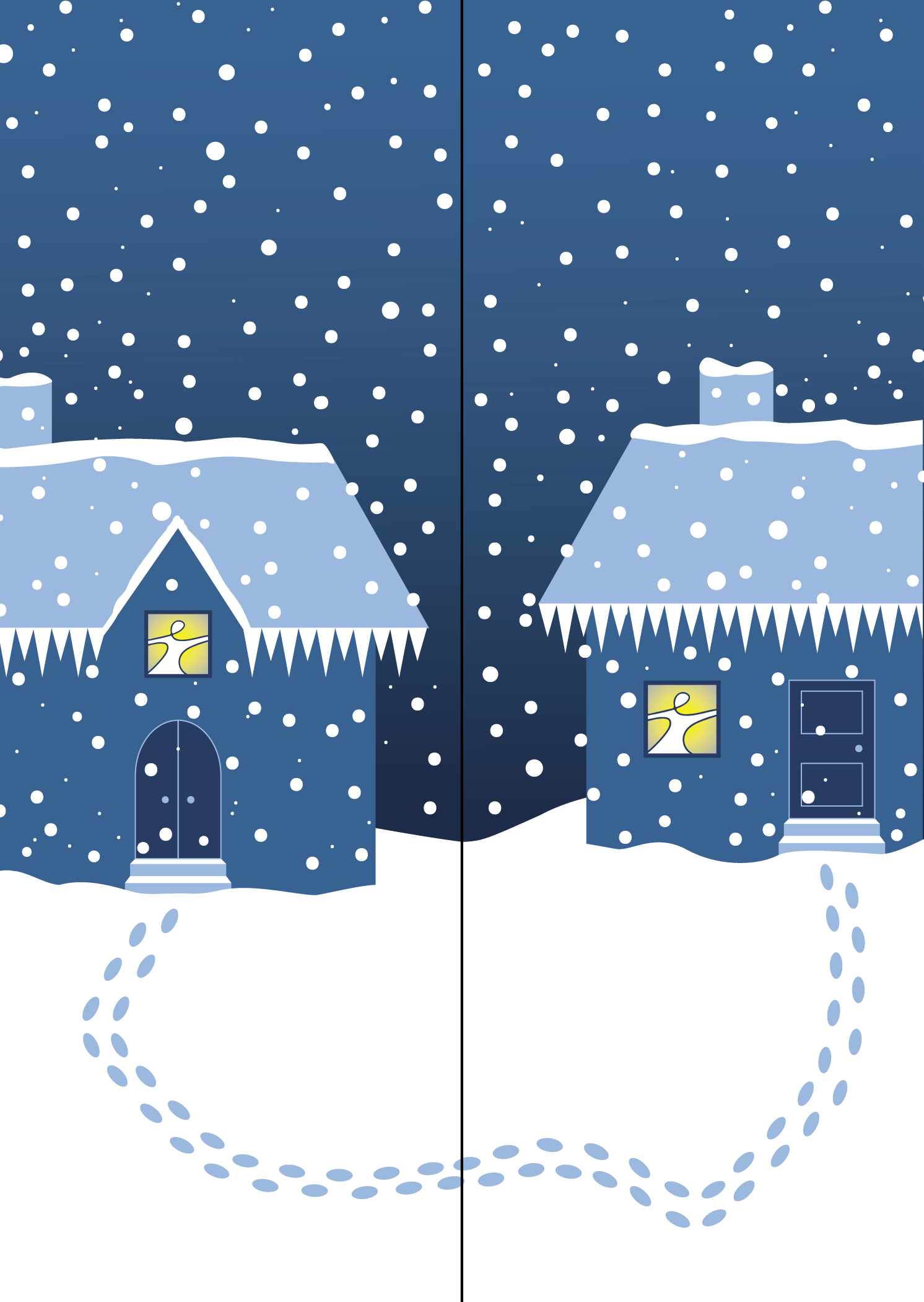
Front of card fully closed. It is the middle of a blizzard; icicles are forming and the snow is starting to build up. It’s freezing. These two houses are very close to each other, yet in harsh weather, can seem very far away. Braving the elements, these neighbors have still managed to visit each other and be together for the holidays. The atmosphere inside the houses are the opposite of outside; warm, cheerful, happy. The people cleverly are a modified version of the Partner’s for Health logo. Each part of the covers functions independently, and the french-door style opening of the card invites you inside.

Inside of card fully opened. Notice how even though there is still a lot of blue to mimic the front, it gives a different feeling. The inside is very calm, elegant, and open. The snowflake pattern on the sides of the inside is referenced on the envelope. The card is folded along the little black lines and then trimmed away.
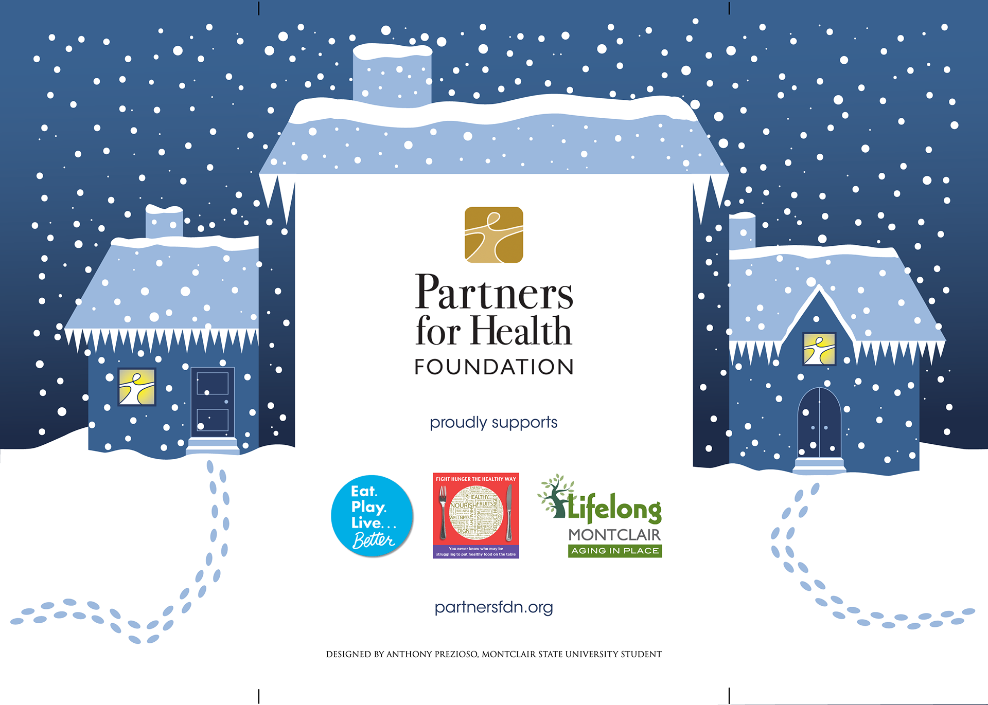
Back of the card along with the two parts of the front fully unfolded. The back has the back of a house with the Partners for Health logo, other partnership logos, their website, and a design credit. They were kind enough to let me put my name on the card, with which I am still very grateful. The snow storm is referenced on the envelope. The card is folded along the little black lines and then trimmed away.

The envelope for the Partners for Health holiday card. being restricted to just one color, I used two different tints of the same blue. The snowstorm and the snowflake pattern are used to parallel the contents inside, along with a modified version of the logo and the return address. There is an empty spot in the middle to be able to write a sending address and the bottom is empty because they needed that room for mass mailing. They printed 500 copies of this card and envelope, and fortunately, they sent me a few copies!