Who doesn’t love a good ol’ space-themed suspense/thriller story? Based on the real-life events of Felix Baumgartner, comes a story about what goes on inside the mind of a daredevil in the heat of the moment.
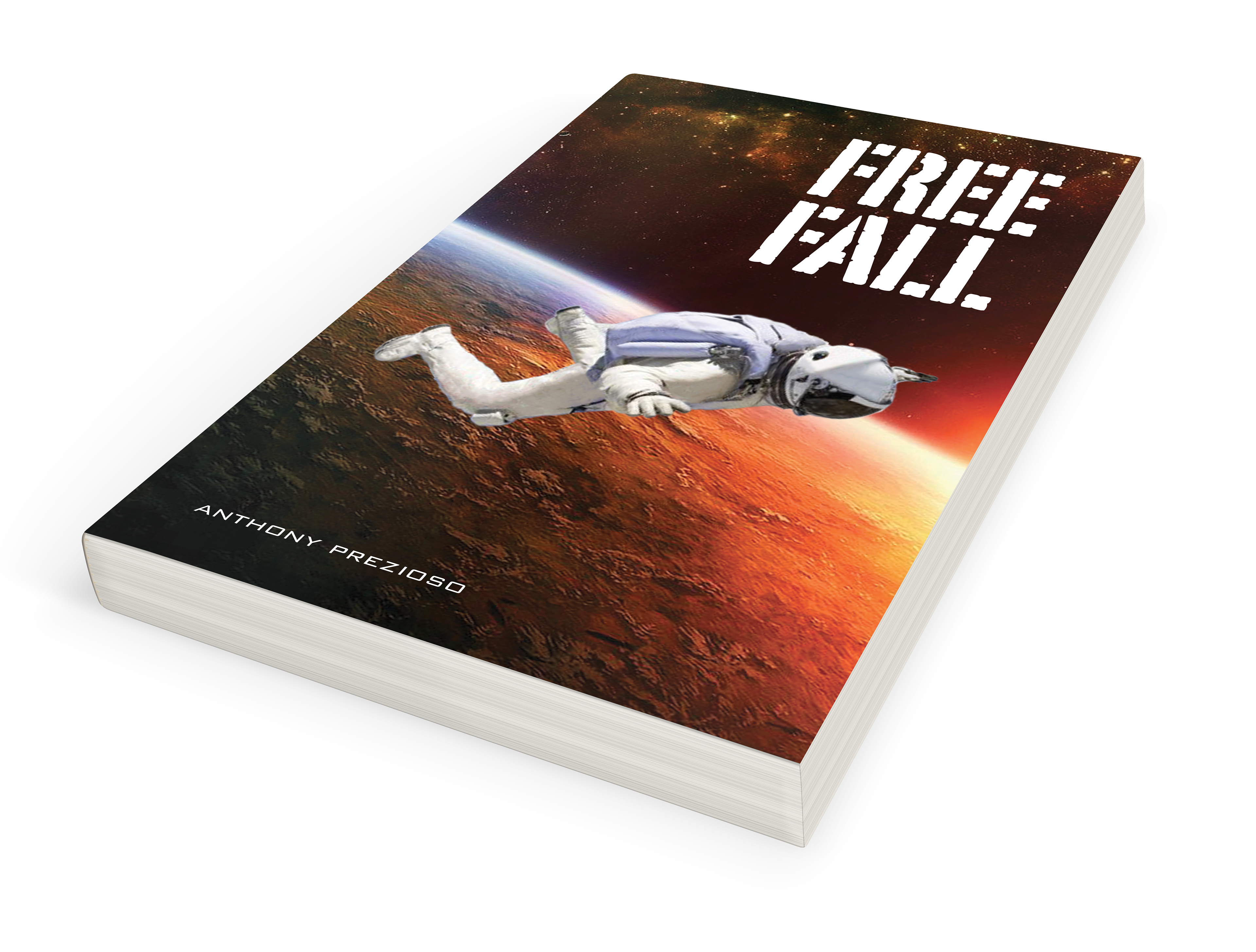
The cover depicts an action shot of Roberto Scavezzacollo (Italian for daredevil) in his spacesuit free falling in space, back to Earth. The overall blue tone of Earth behind him represents the safety of where he started, while the intense warm colors such as the reds, oranges, and yellows, represents the dangers that lay ahead. The horizon line of Earth is directly in sight of his visor, which helps to overlap the starry background of space, planet Earth, and Roberto himself. They say not to judge a book by its cover, but we all know that is just for books with bad covers. This book looks like it’d be full of action, and you’d be correct. Talk about falling with style, huh?
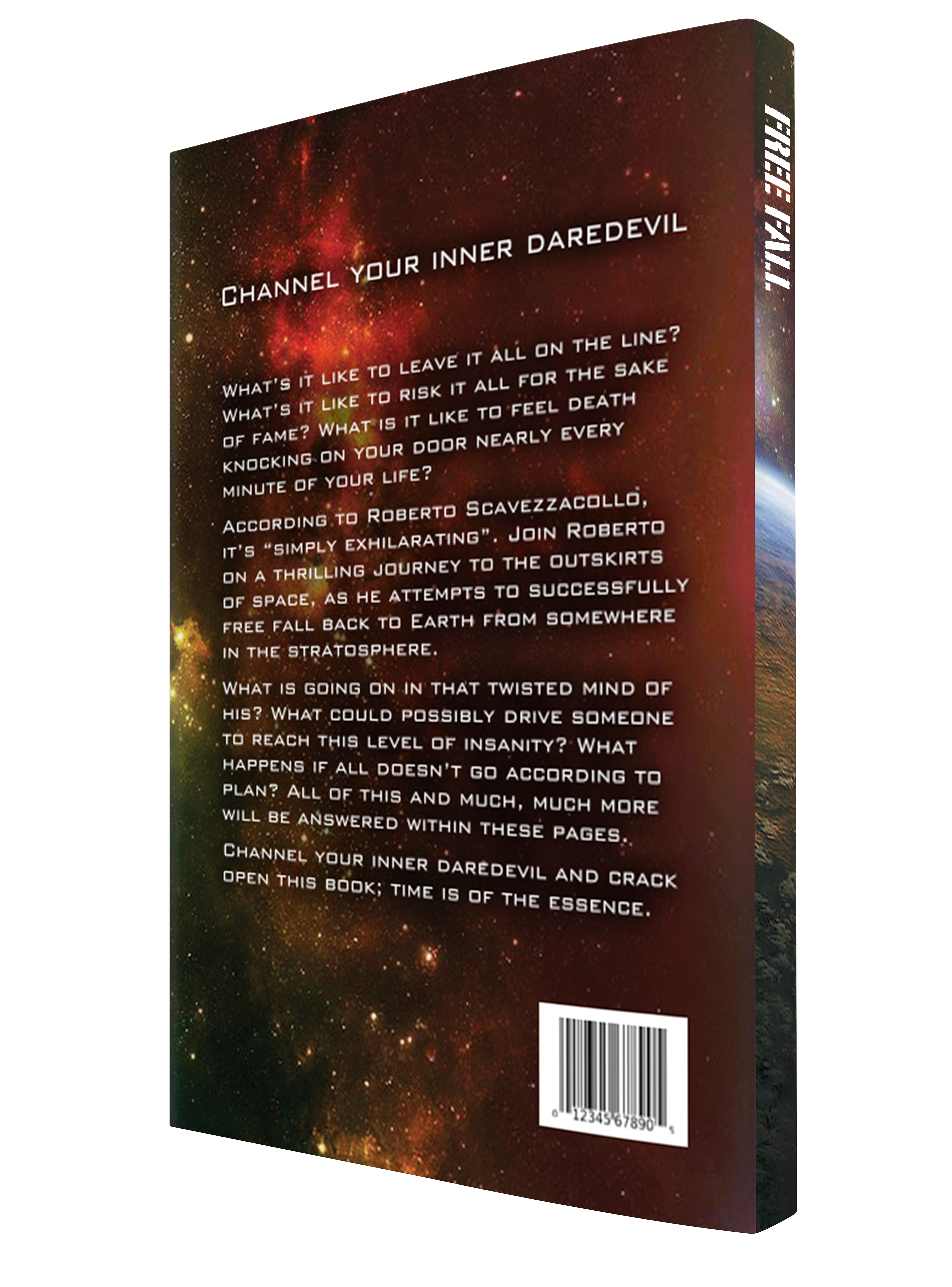
The back of the book gives the tagline of the story, followed by the synopsis and barcode, while the spine is an extension of the cover. Space is, of course, a common location in the story, so it makes sense to have a starry, space themed background for the back as well.
Process, Sketches, and Previous Version

For the original version of this book cover, I was content with all of the visuals, but was not satisfied with the type at all. Since the focal point is the astronaut, I desired for the type to be a little bit more reserved. When there is too much competing for the focal point role, it seems rather “busy” which makes a book cover look very cluttered, which is something I never try to do. While the overall imagery is good, in my opinion, it could be slightly enhanced to give more of a danger-like vibe. This, along with the type, would be worked on for the modification/update.
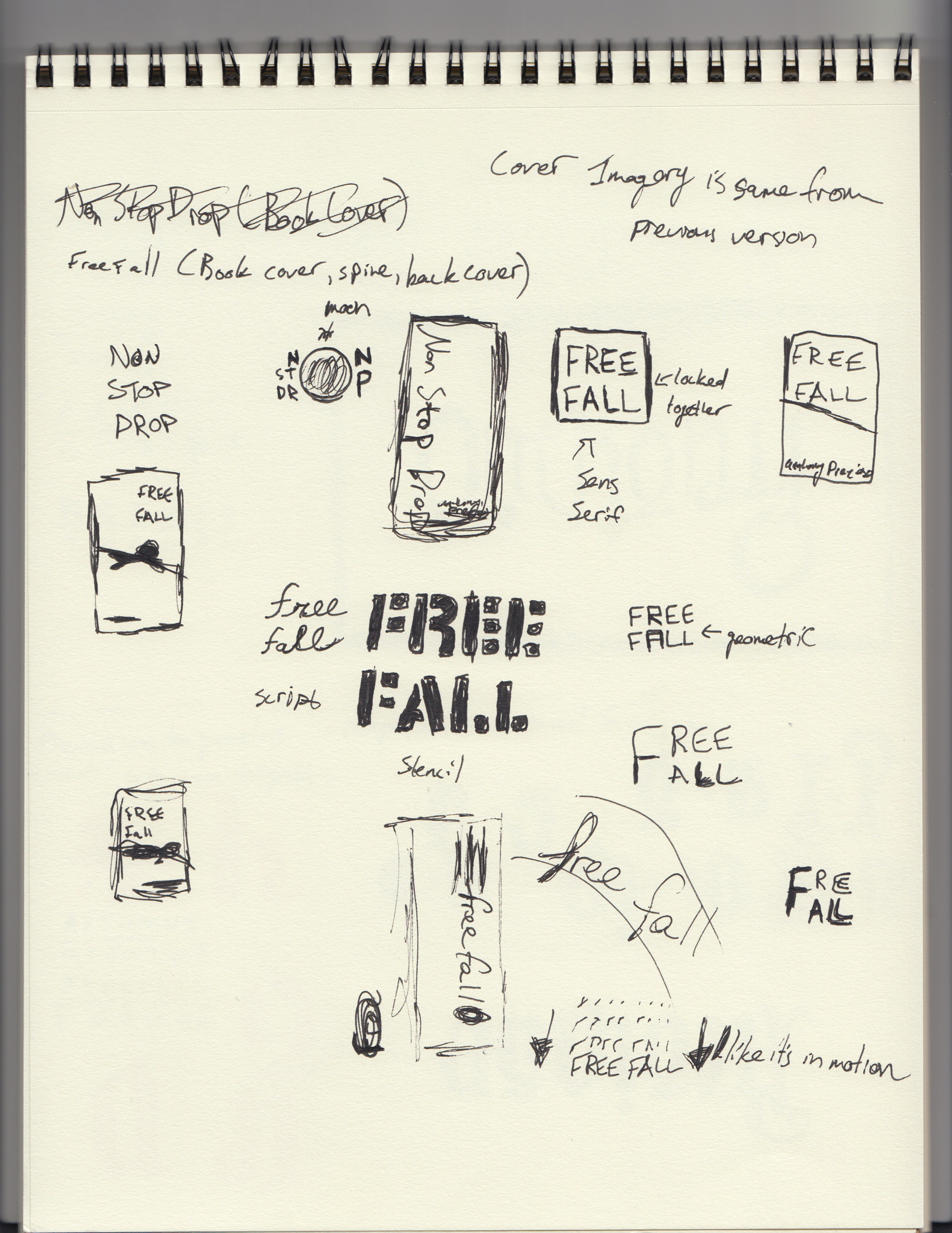
I also wanted to change the name of the book from the given title of “Non Stop Drop” to “Free Fall” since that was a title I felt was fitting, given the plot of the story. Going off of the new title, I thought of different ways to portray “Free Fall” as something suspenseful, yet reserved. After trying various ways, I settled for a slightly damaged, sans serif stencil typeface. This can give a hint of intensity, while not overshadowing the astronaut. A runner-up was the sketch on the bottom, where the type was on its side, with motion blur above it to look like “Free Fall” is actually free falling. This seemed cool, but would clash with the imagery. Maybe that could be the basis for a type-only book cover in the future? Once the cover was done, I also needed to make a spine and back cover, two things I did not have before. These followed similar themes of the cover, while also giving a synopsis of the story.
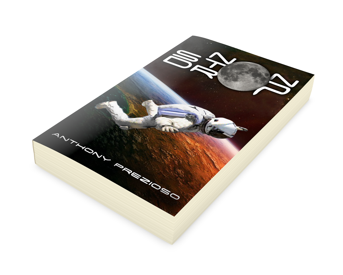
An in-process version of the book cover. By removing the sky-blue ornaments around the title and author, my vision was going in the right direction, but still left a lot to be desired.