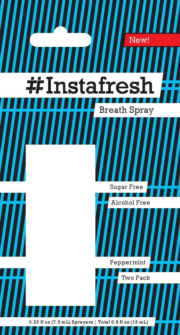
Have you ever gone into a pharmacy or supermarket and noticed that a lot of general health merchandise just looks the same on the shelf? If brand names weren’t on the front of the packaging, it would be extremely difficult to tell one apart from the other, when it comes to the same type of product. That is where Instafresh comes into play. Embracing a target audience of teenagers to young adults, Instafresh not only provides a breath spray that will freshen your breath, but also has fresh packaging as well. Utilizing diagonals and bright colors in conjunction with black help to make the blister pack virtually “pop” when compared to the sea of plain packaging. Those same diagonals are referenced in the logo, which features a deconstructed version of the hashtag symbol, or pound key as it was known as back in the day, incorporating an I and F for Instafresh.
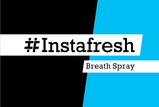
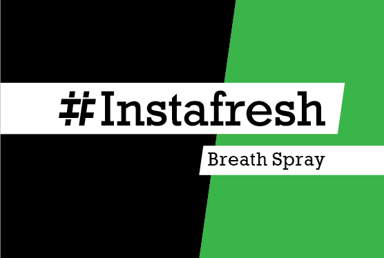
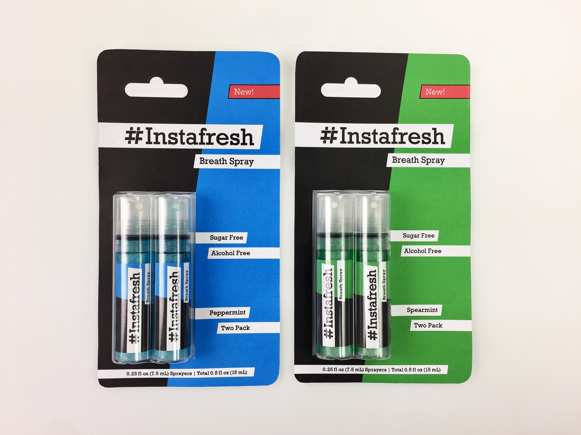
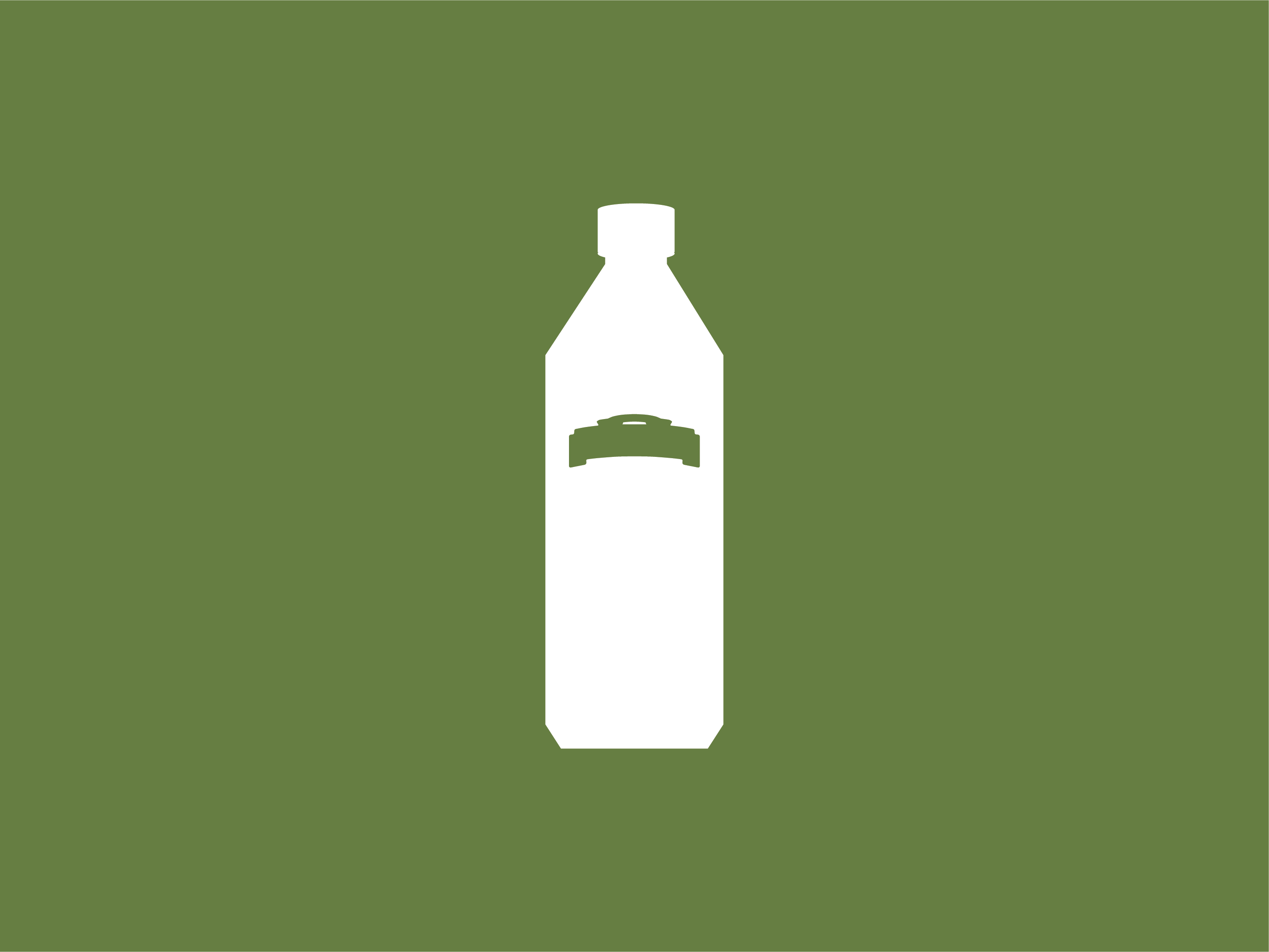
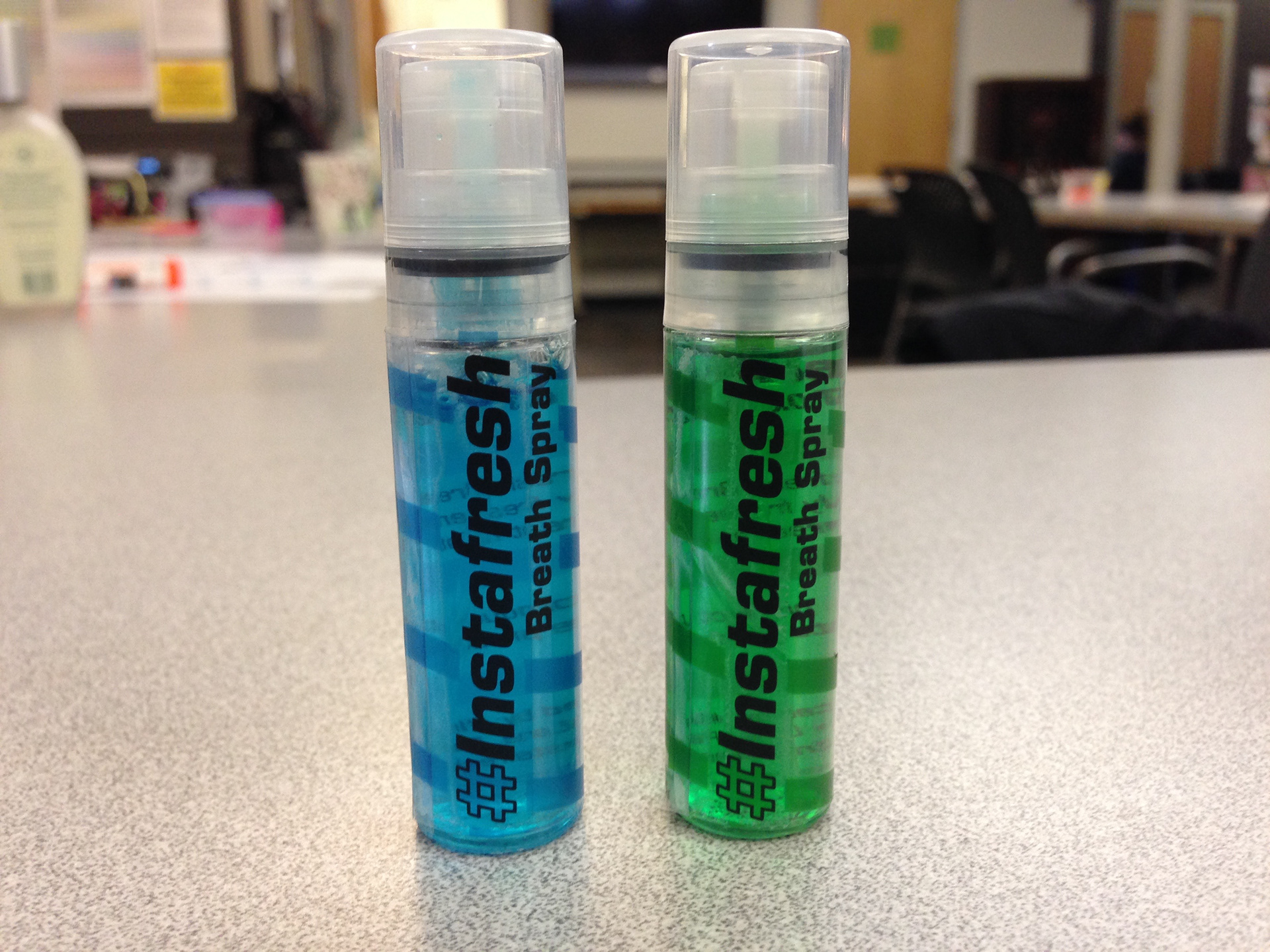
Labels for the individual bottles of breath spray and photos of the front of the packaging. Blister packs normally are packaged in the center for even weight distribution, but by sliding the actual plastic and the shelf display cutout slightly to the left, it can still hang level while leaving more room for copy on the right side. Displayed are two different types of Instafresh breath spray: peppermint (blue) and spearmint (green).
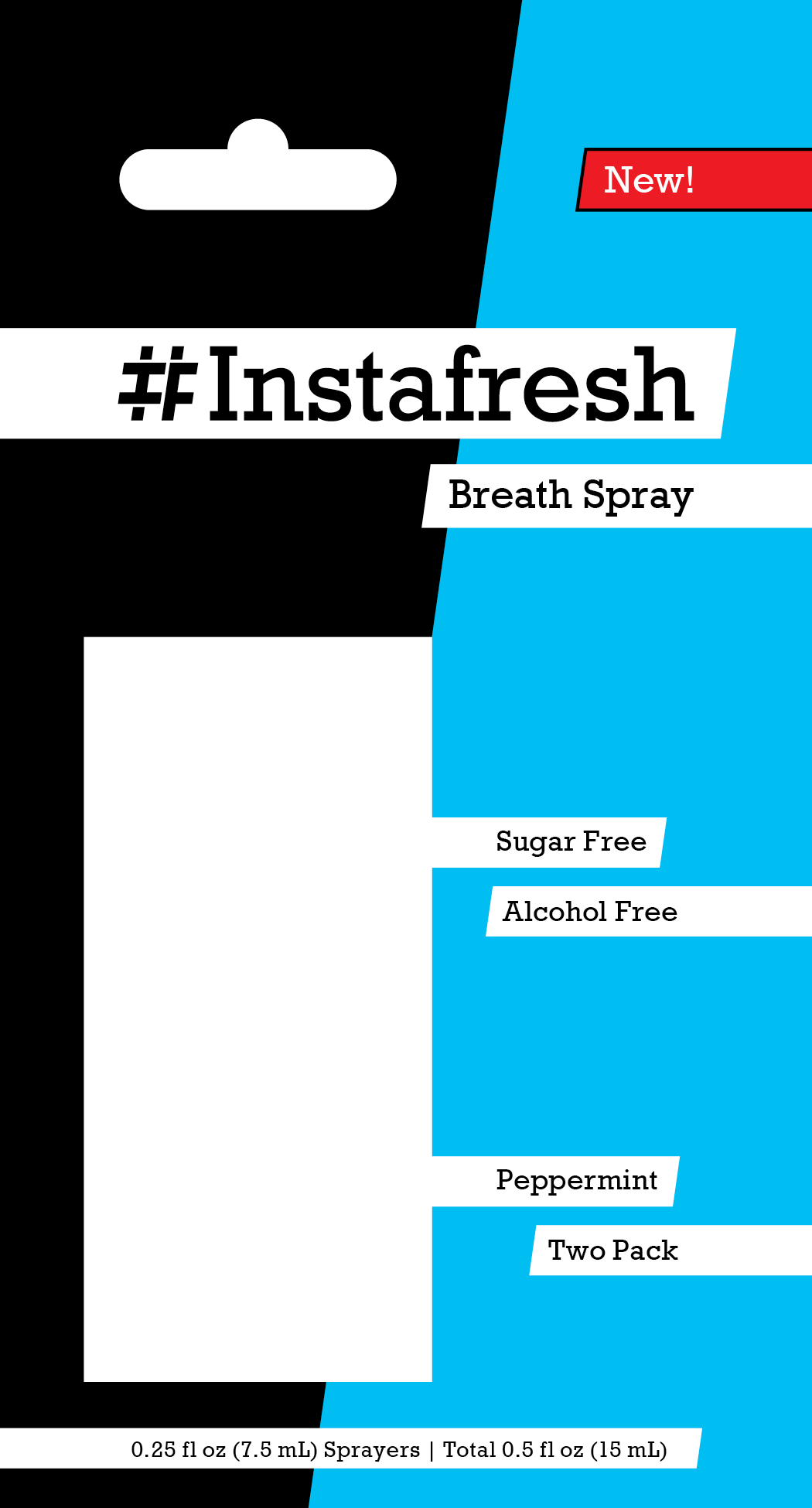
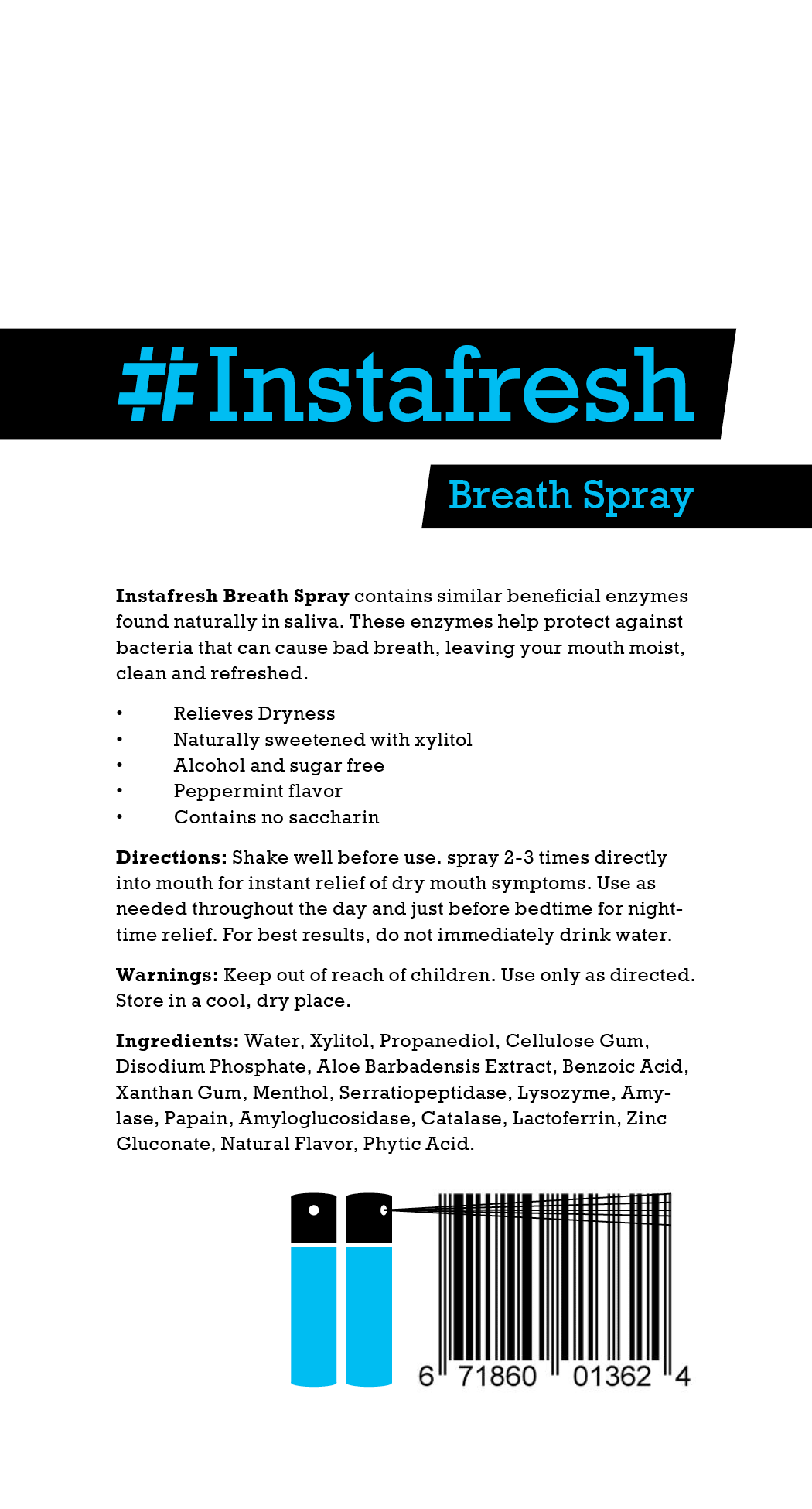

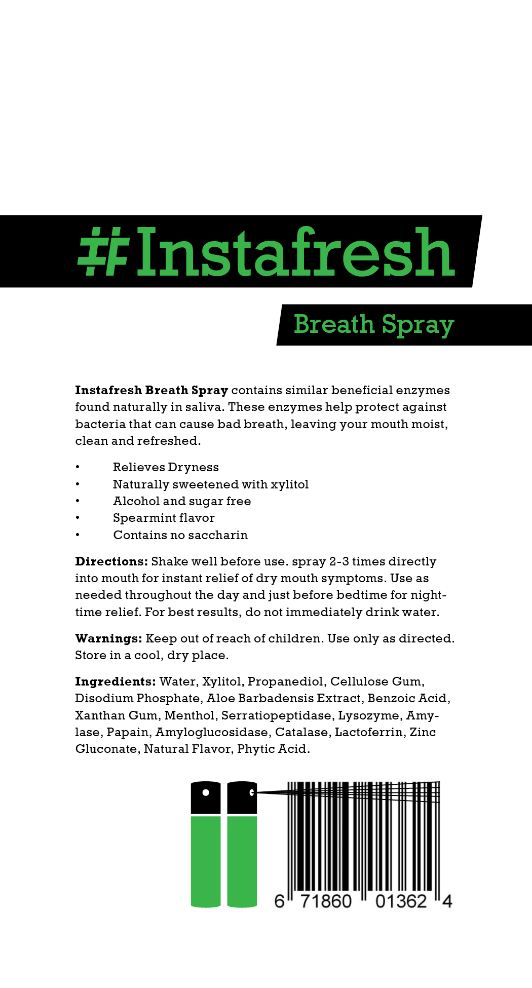
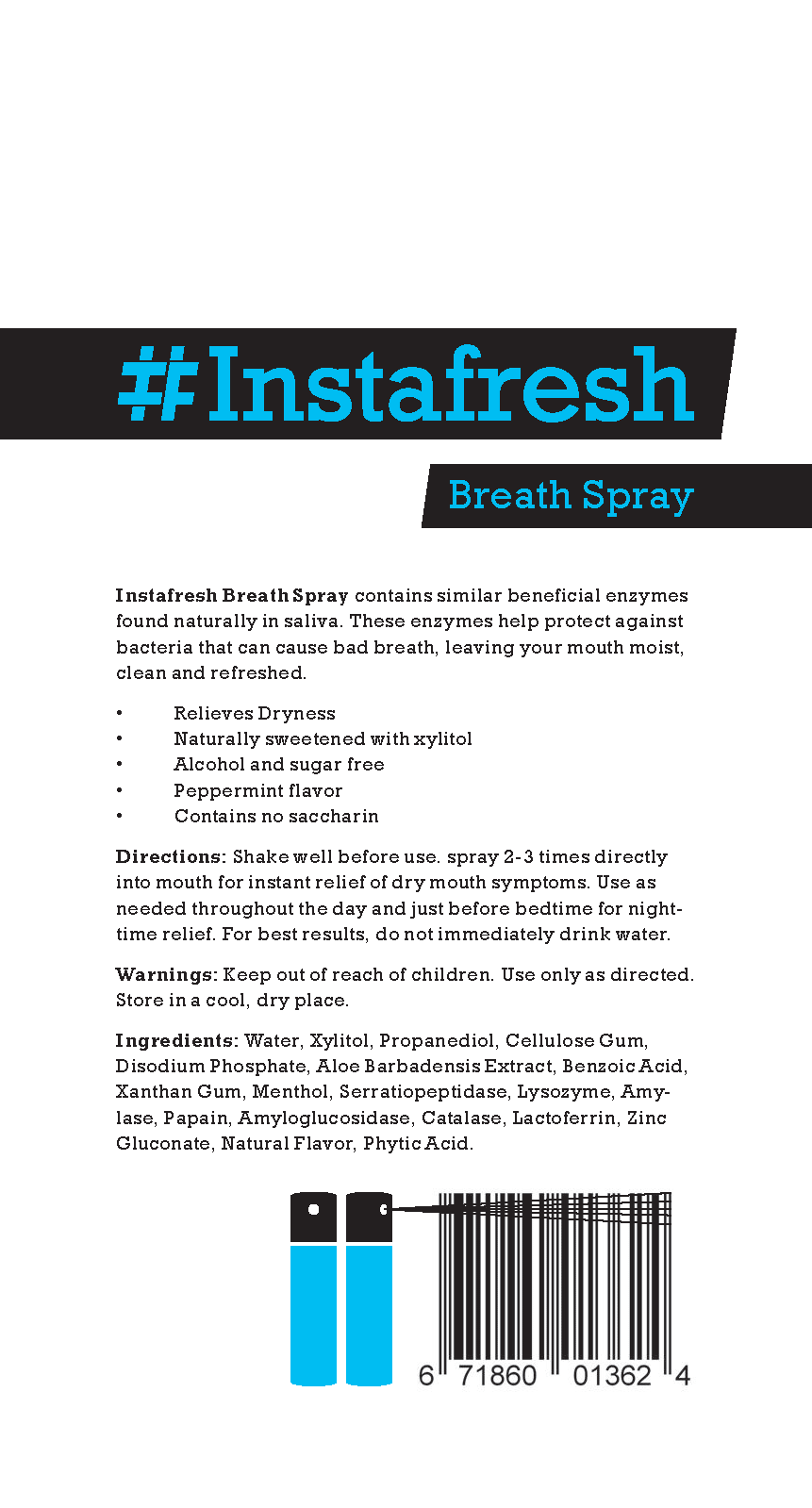
Front and back renders of the blister pack. On the back of the packaging, there is a description of product, along with directions, warnings, and ingredients. There is also a little illustration of the two bottles that come in the blister pack interacting with the barcode. I always love seeing the barcode becoming a part of the package, rather than just slapped on at the end. Don’t worry, the barcode still scans as it normally does.
Process, Sketches, and Previous Version
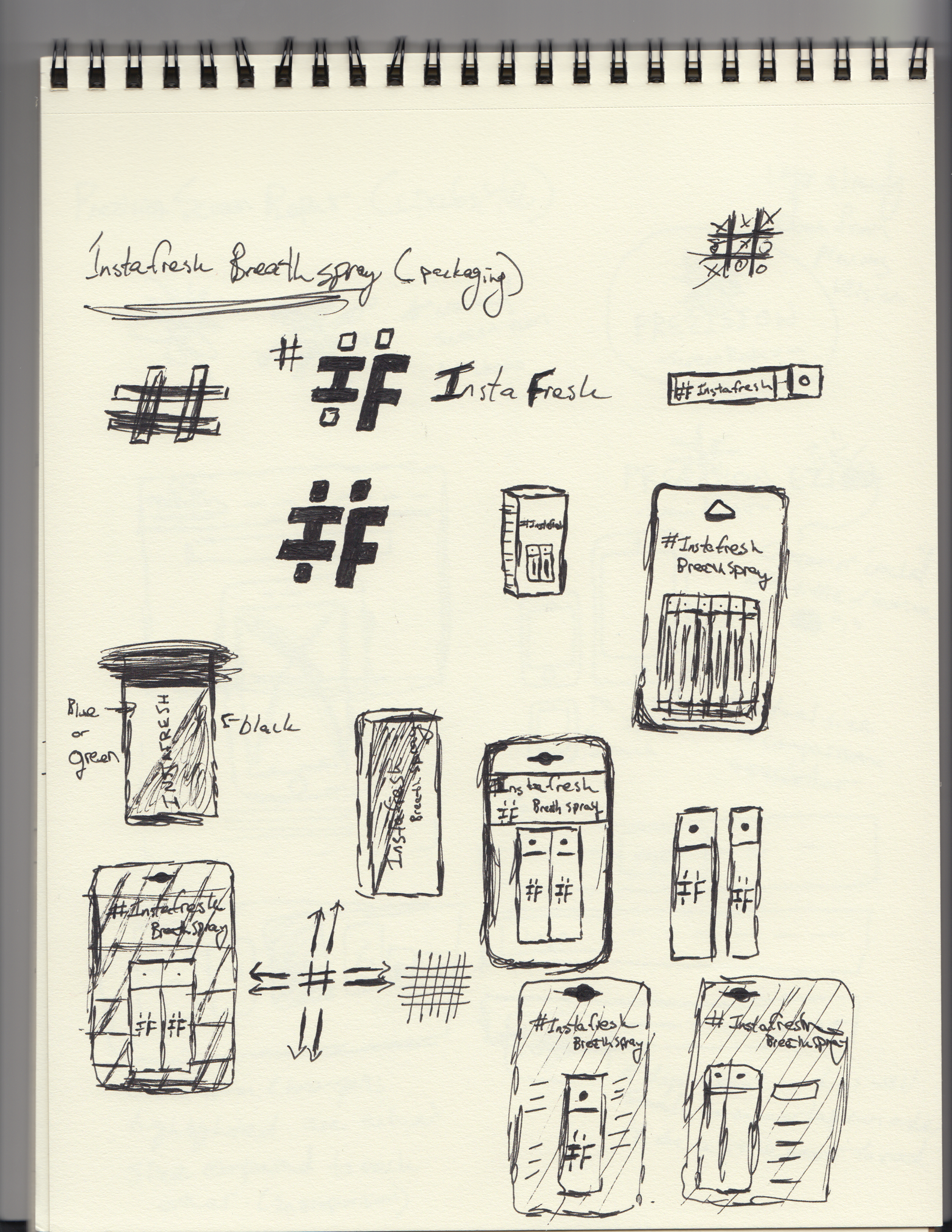
Going off my previous version of Instafresh Breath Spray (picture before the sketches), there were a lot of aspects I wanted to keep, and a lot more to add as well. This project served as more of a simple expansion, rather than a complete overhaul. Adding on to, and refining the bottle labels, I needed to create the packaging for a one pack, two pack, or multi-pack. I wasn’t sure on what form the packaging would take, but ultimately chose on the blister pack, as it just came to make the most sense. The I and F within the hashtag was actually an unused item from the prior version. Incorporating the new I F hashtag logo with “Instafresh” in a new typeface, yet similar in orientation, helped to kickstart this project.
This was the first draft of renders for the Instafresh blister pack. I wanted to play off the slight diagonals of the hashtag throughout the design, but looking back, it definitely was a little overboard. For more or less, everything besides the background stayed in place, give or take a few minor tweaks. The back of the blister pack stayed exactly the same, which helped to bring a little bit of cleanliness to the front, which needed simplifying. Instafresh’s labels would not be designed until the blister pack design was done, as it would mirror in form.