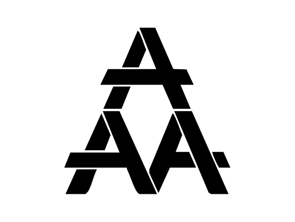
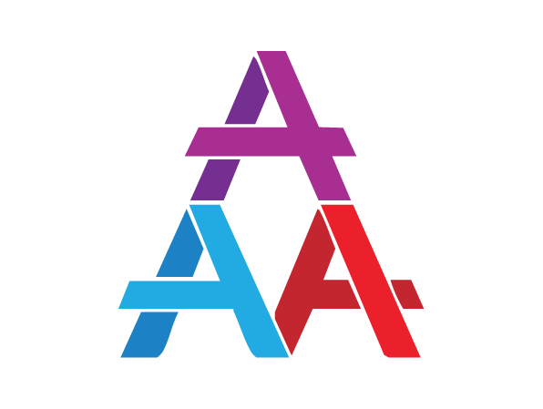
Logo used internally at a previous job's Marketing Department consisting of 3 people: Ashley, Ashton, and myself. The 3 A's are for our names while Ashton and I reported to Ashley. My favorite color is red, Ashton's is blue, Ashley's is purple. The color combinations worked out perfectly as Ashton and I were Ashley's foundation for our company to move in the upwards direction as symbolized by the upward facing arrow. Full color version above and black version below.