For over thirty years, The Legend of Zelda video game series has been nothing short of, well, legendary. Since 1986, the series has continuously changed the formula on what makes a Zelda game, a Zelda game, often regarded as one of, if not the highest critically acclaimed game series’ of all time. This has kept the series fresh to the general public, as opposed to many franchises that just wash, rinse, and repeat “new” titles yearly to grab a quick buck (cough cough Call of Duty, Assassin’s Creed, cough cough). With time gaps ranging from 2.5-5 years on average for new mainline releases, it is obvious that the development team at Nintendo values quality over anything else. This is a decision I wholeheartedly respect and admire; it’s a lesson I try to utilize in my own design work.
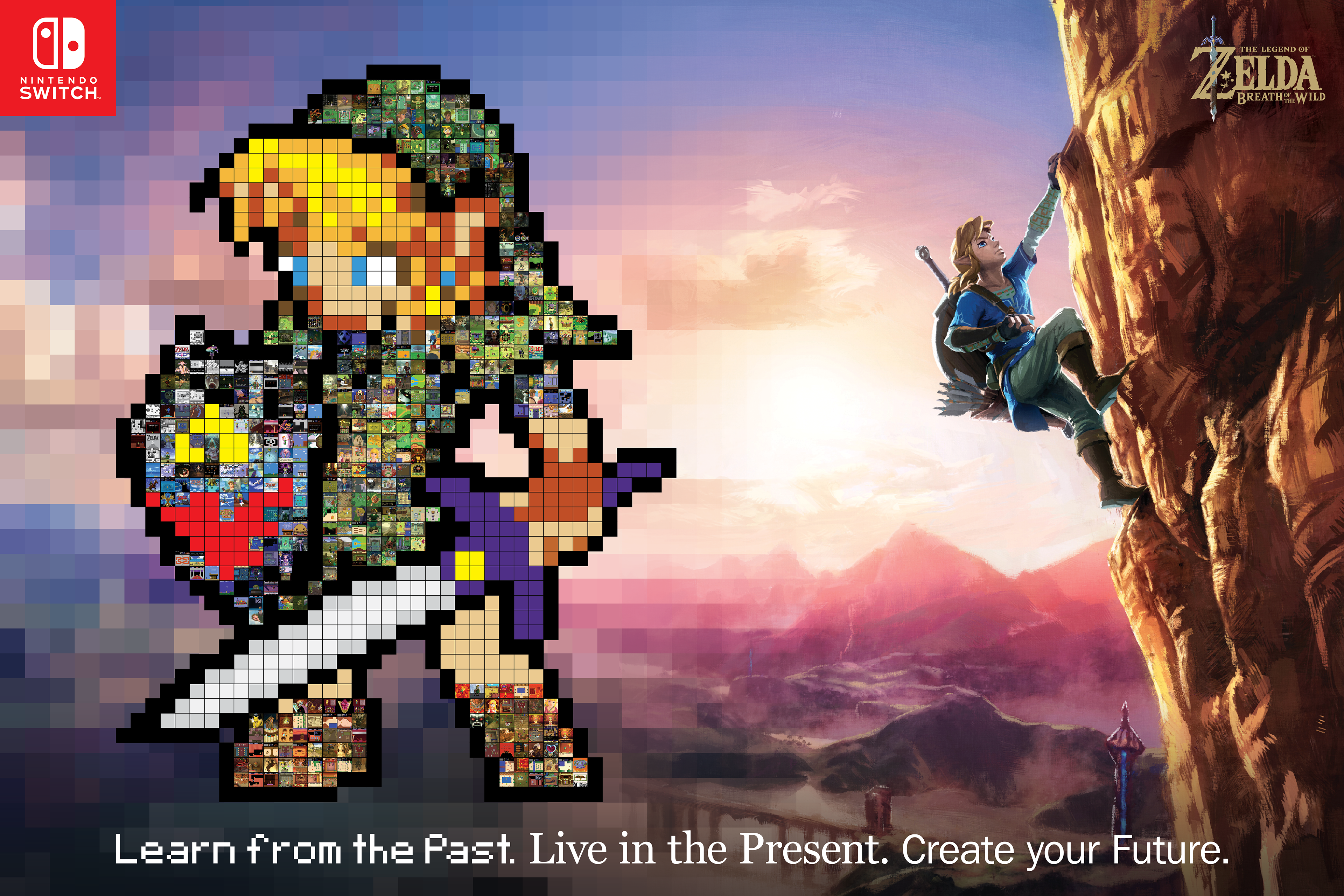
Above is a 36” x 24” poster commemorating the first thirty years of the franchise, while also embracing the present and looking towards the future. The vocal point is the huge 16-bit custom sprite of the main character, Link, collaged together into a mosaic of screenshots from the seventeen games released in the first thirty years acting as the individual pixels needed to create the Link sprite. These, coupled with the bond of the color of the images and the proper color location, create something that is truly unique to look at from up close, and far away.
The figure of Link in the official artwork from Nintendo to the right is how he appears in the newest title, The Legend of Zelda: Breath of the Wild, released in 2017. This game takes the series in a whole new direction, breaking the conventions of the series. For the first time in HD and open-world, the map is an amazing 19 times bigger than the previous biggest version. The game also introduces the ability to have weapons break, to climb nearly any surface, and much, much more. Breath of the Wild is a massive turning point in the series where everything has changed. But, it is, without a doubt, imperative to learn from the past, live in the present, and create your future. There is only one word to describe the legacy of Zelda—legendary…and what a legend it is.
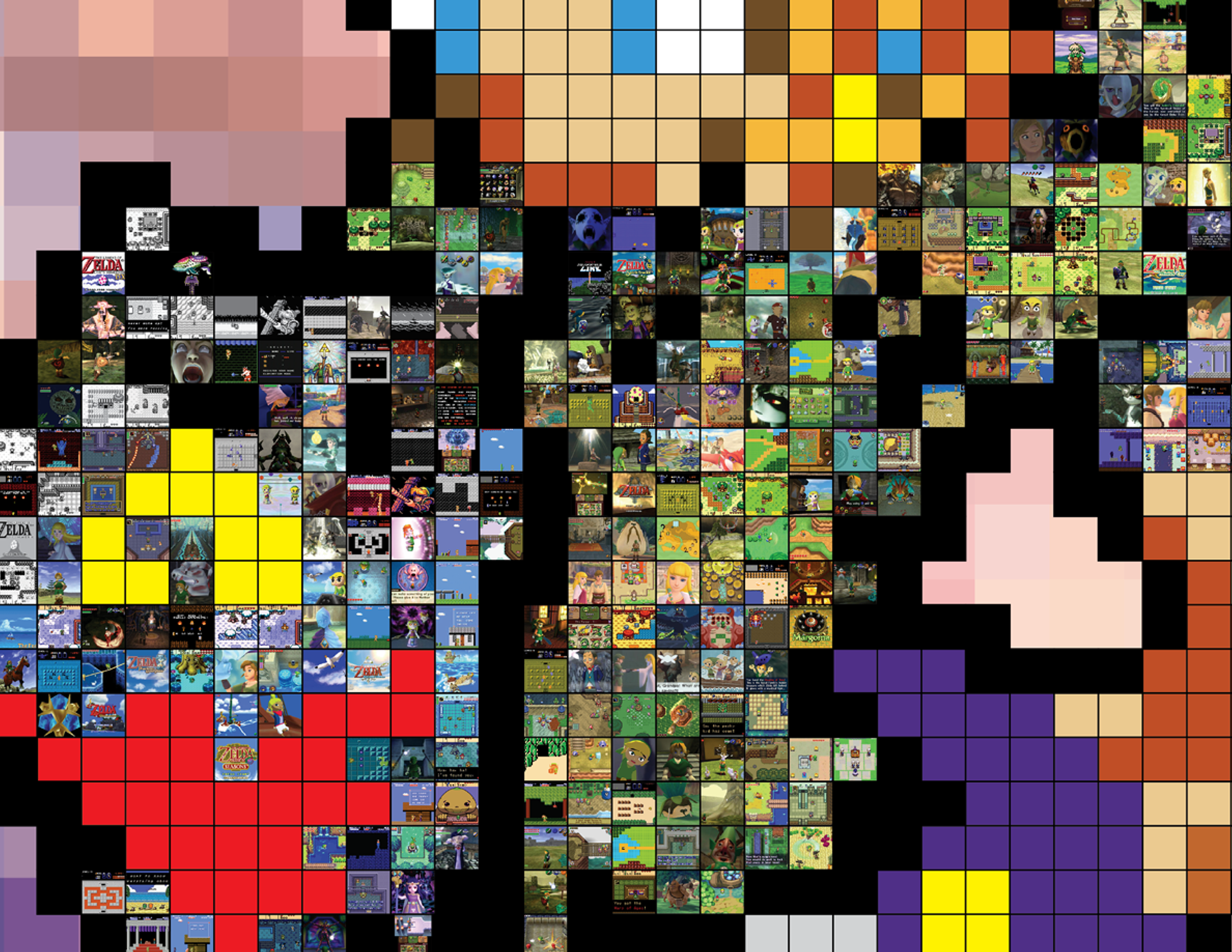
This is a small snippet of the same poster, but heavily zoomed in so it's easy to see the detail of each individual screenshot. True Zelda fans should be able to recognize nearly all, to all of them! You can do it! I believe in you.
Process and Previous Version

The idea of using a mosaic to work as collaged pixels originated from The Legend of Zelda: Chronology,
a book for an intermediate class I took a while back. In the book, I gave brief overviews of each game, created controller renders for each associating platform, and all of this along with an 8-bit sprite of in-game items collaged with screenshots of the game acting as some of the pixels for said sprite. In regard to the two pages shown here, The Legend of Zelda for the Nintendo Entertainment System in 1986 is accompanied by the red candle, with all of the screenshots portraying the wax of the red candle. Also, The Legend of Zelda: Majora’s Mask for the Nintendo 64 in 2000 is paired with a sword and the screenshots act as the blade. I had the idea for incorporating this idea with a Link sprite at this time, but never had the chance to do so for this project. Better late than never, right?
a book for an intermediate class I took a while back. In the book, I gave brief overviews of each game, created controller renders for each associating platform, and all of this along with an 8-bit sprite of in-game items collaged with screenshots of the game acting as some of the pixels for said sprite. In regard to the two pages shown here, The Legend of Zelda for the Nintendo Entertainment System in 1986 is accompanied by the red candle, with all of the screenshots portraying the wax of the red candle. Also, The Legend of Zelda: Majora’s Mask for the Nintendo 64 in 2000 is paired with a sword and the screenshots act as the blade. I had the idea for incorporating this idea with a Link sprite at this time, but never had the chance to do so for this project. Better late than never, right?

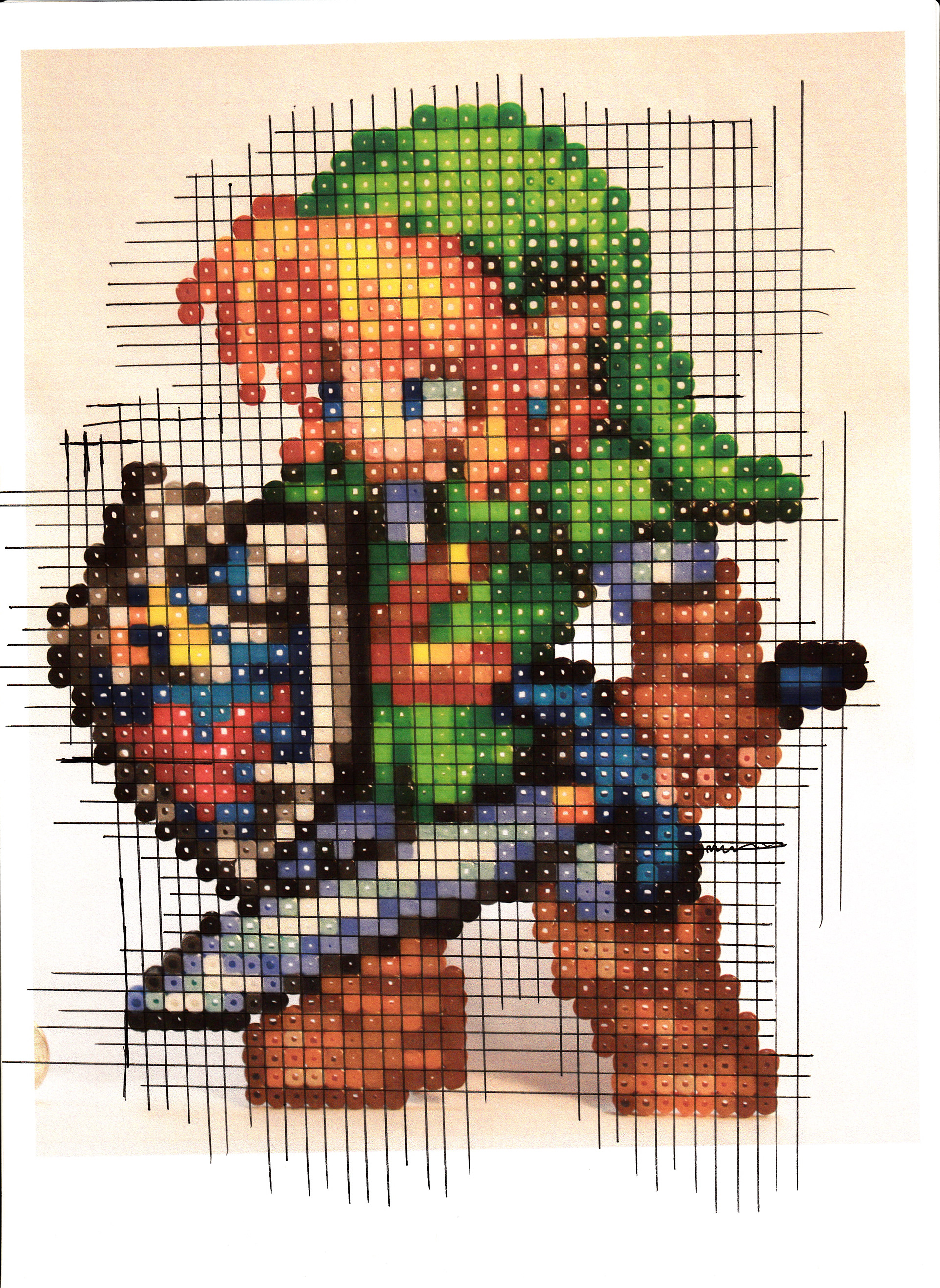
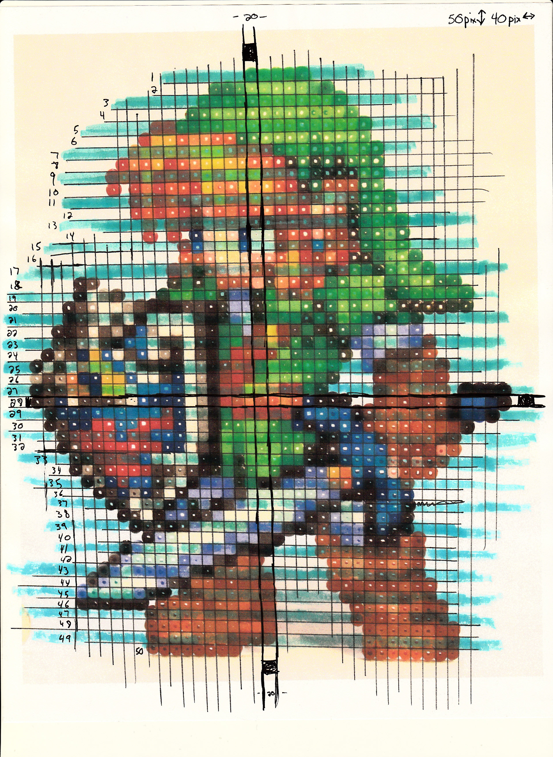
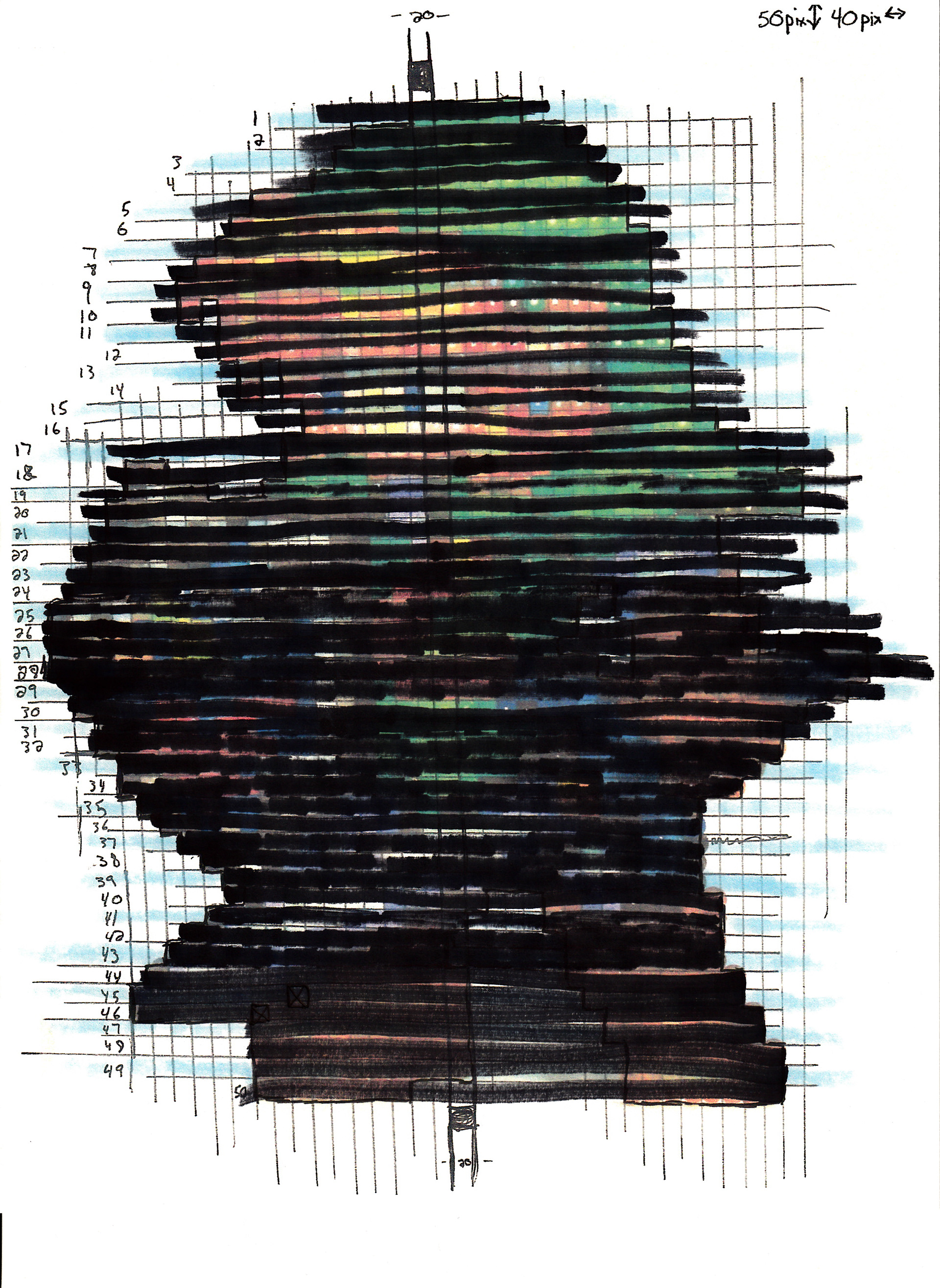

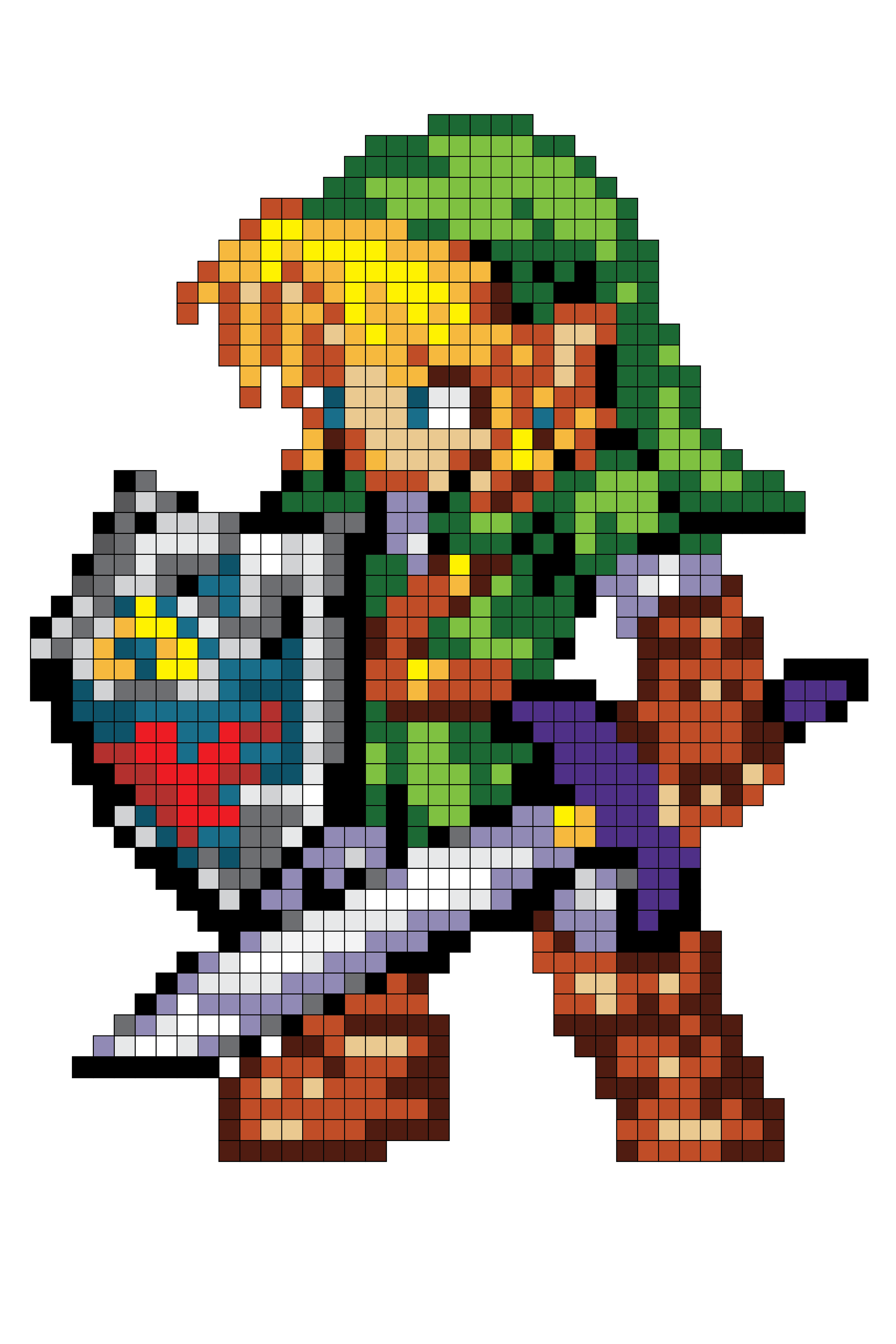
After some research, I found a custom Link Sprite made of beads I could use. I then created a grid and divided up each individual pixel to see which color belongs where. Since this is a 16-bit sprite, there can only be a max of 16 colors, but less is preferred. I then highlighted every other row to help with clarity and crossed out each row once each pixel became digitized. Once the layout was complete, I set all of the pixels to gray and then colored each one, one by one, making sure to not go over the 16-color maximum. The bottom-right picture is the finalized version of my 16-bit sprite with full color.
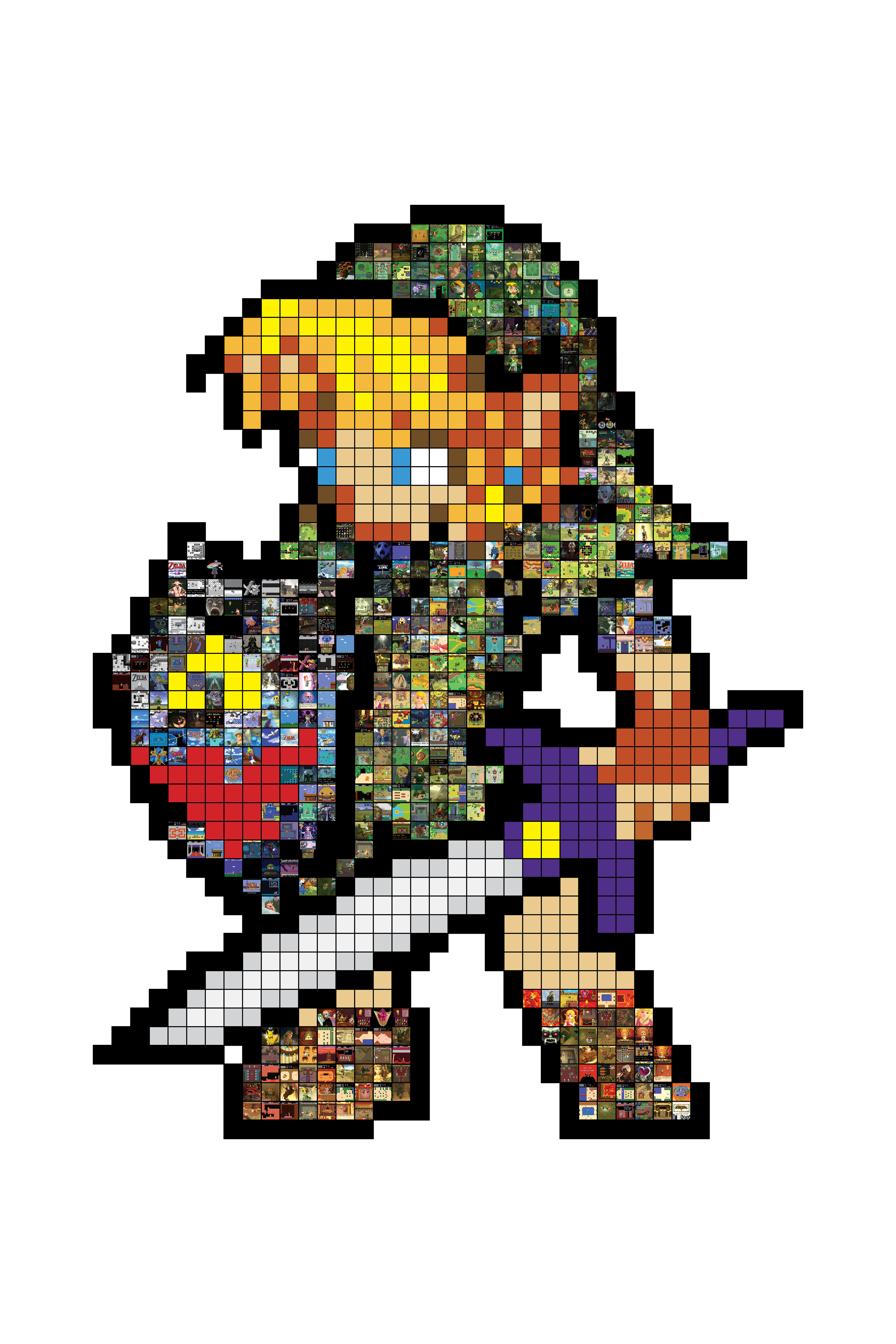
After simplifying my colors to maximize contrast with the screenshots, I separated all of the screenshots I had from the first thirty years of games into piles by overall color: green, blue, gray, red/brown, and other. I then started matching colors and randomly placed into the appropriate spots. After doing so, I checked to see if any two pixels next to each other were from the same game. If they were, I’d rearrange them so that wouldn’t be an issue. There were only a few cases of that, so I was lucky. This is the final version of the sprite with the screenshots in place.
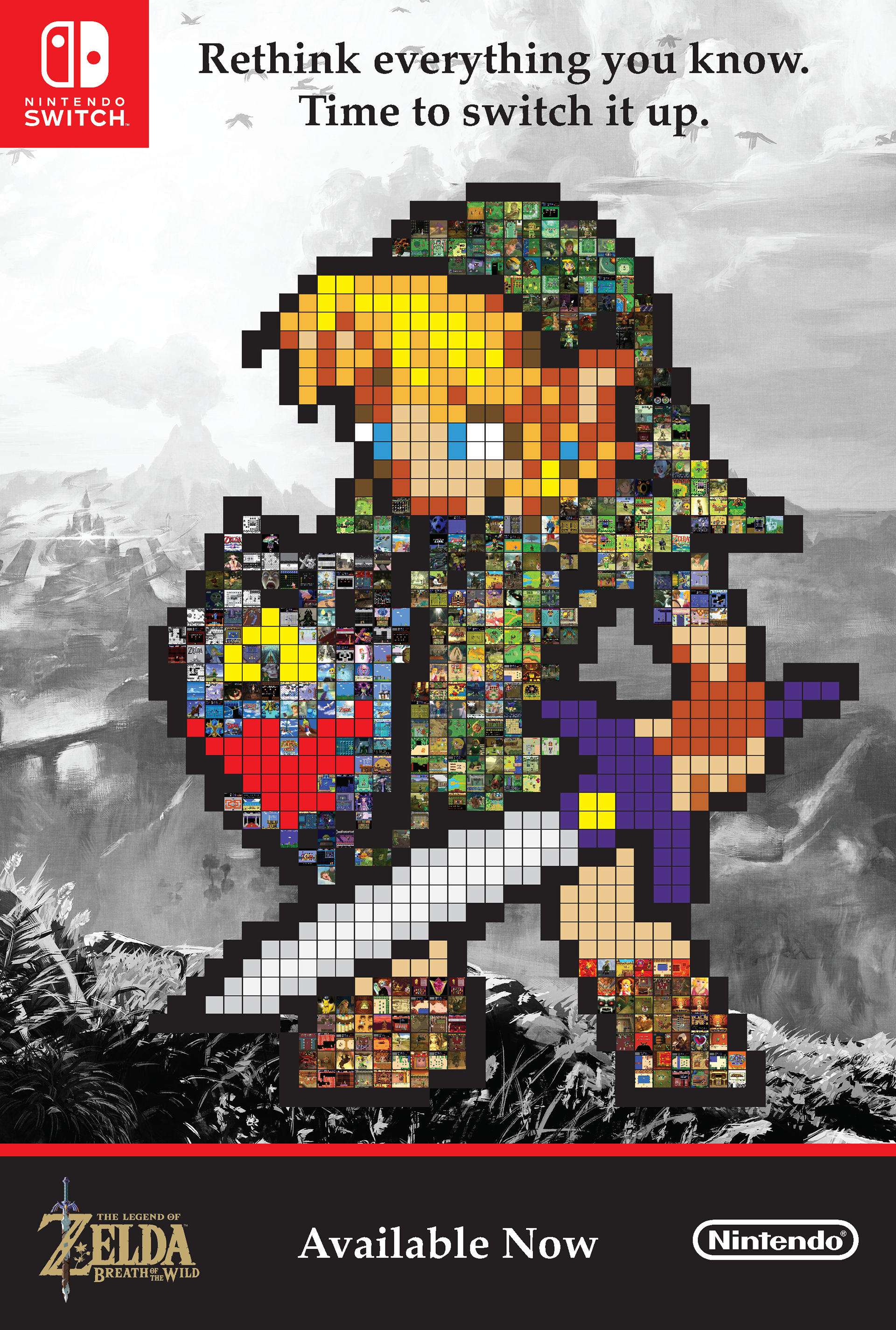
This is the first version of my 36” x 24” poster featuring the Link Sprite in all its glory. I decided to tie the poster with promoting The Legend of Zelda: Breath of the Wild, the newest title in the series released in 2017. Tying this imagery with a recent title is proof that I learned something during my business minor program; marketing concentration for the win! I used official artwork for the background, but modified it to act as just that—a background. Converting the image to black and white helped to ensure the foreground would pop.